Sometimes, after a spell of dreary days, I need a little wardrobe whiff of lightness and brightness.
Ah, sweet escape into coral and floral.
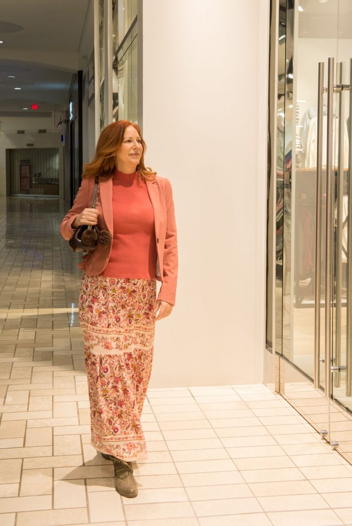
Does color affect your mood ?
I know it does mine.
I could feel the bad weather blahs melting away as soon as the coral mock-t went on and the colorful skirt slid into place. Yes, that quickly. And the longer I wore this outfit, the lighter and more energized I felt. Color is powerful stuff, my friends.
And science agrees. Color is light energy and has vibrational frequencies. Each color has a specific wavelength, frequency, and amount of energy associated with it. Our bodies react to these vibes on both psychological and physical levels. Chromotherapy, or color therapy, has been around since the ancient Egyptians and Greeks. Egyptian healers had solarium rooms built with panes of colored glass in the ceiling that would color the light streaming in, shining on the patient. Today’s version of color therapy can be found in different light therapy treatments and is treating conditions from depression to cancer.
If you want to nerd out a bit on chromotherapy, you can check out one of my favorite science articles “A Critical Analysis of Chromotherapy and its Scientific Evolution” by Azeemi and Raza found in the peer-reviewed journal Evidence-Based Complementary and Alternative Medicine (eCAM).
Or…you can rely on the quick tip that color psychology gives us: warm colors (red, orange, yellow) energize you and cool colors (blue, green, violet) relax you.
Today’s uplifting colors are proof for me that fashion is transformative. Ah, that coral.
But wait, isn’t that a Fashion Don’t: Redheads wearing pink/coral/red? Great! Nothing better than being a fashion rogue, rebelling against the weather AND the establishment (the fashion Man?). The color makes me feel brighter and cheers me up. Decision made.
So many fashion rules to break, so little time.
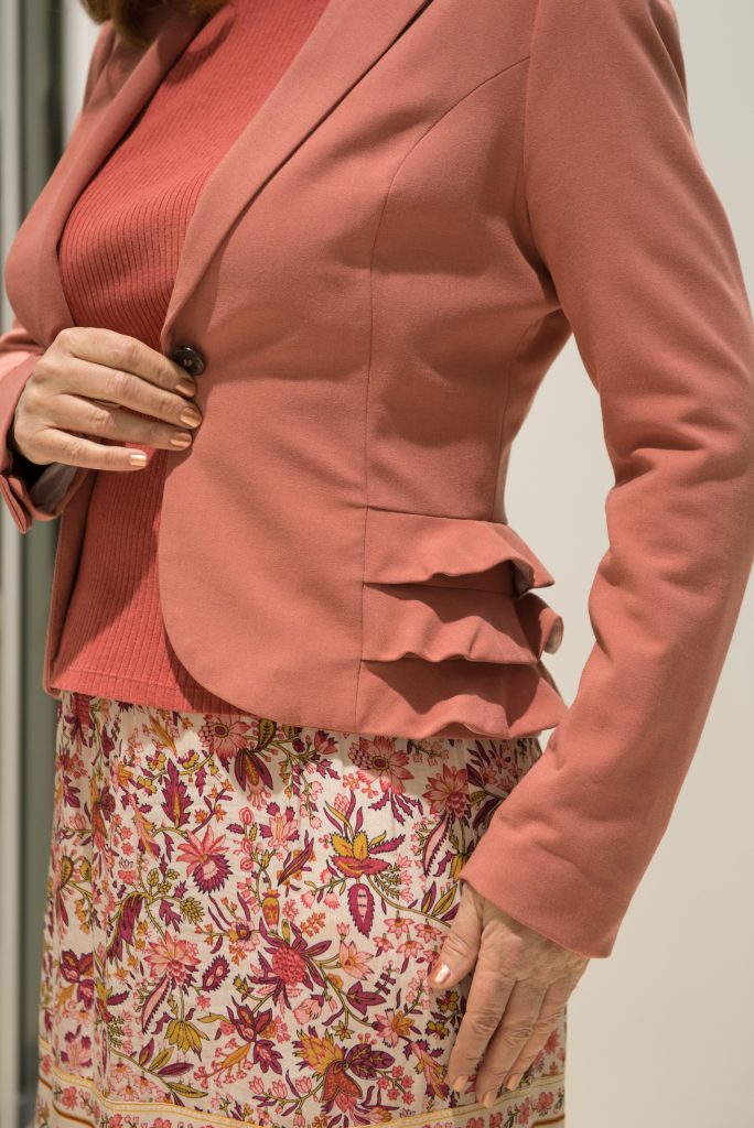
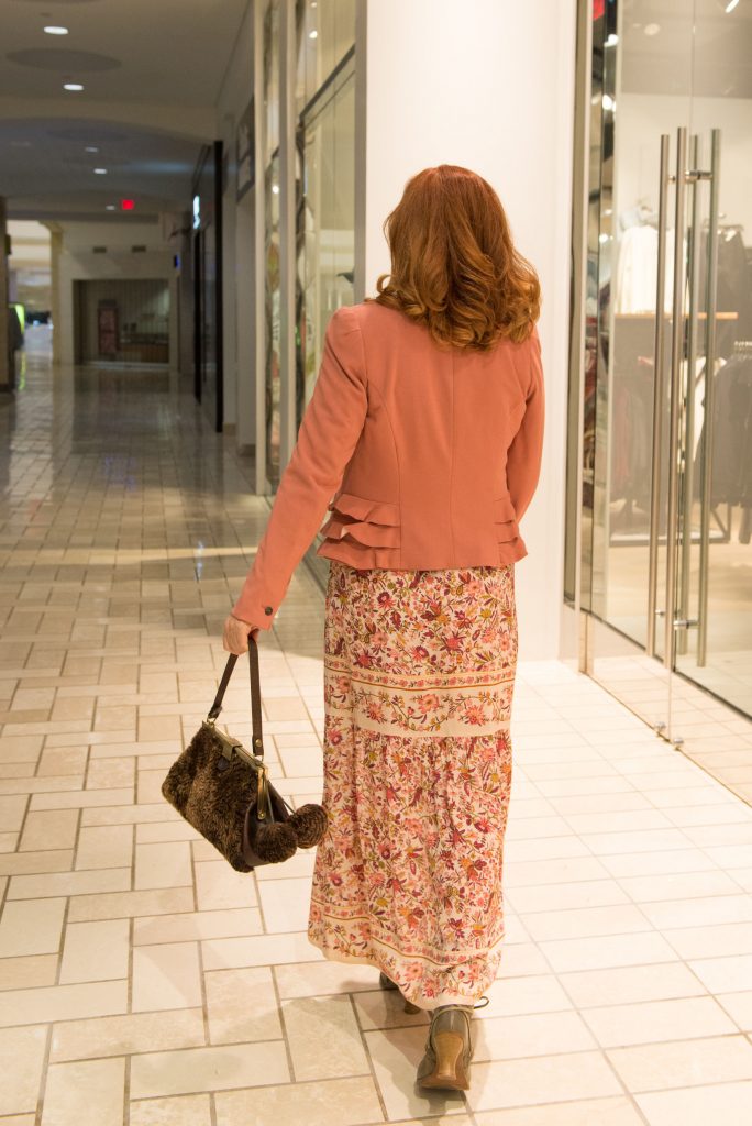
What I love about this jacket is that it celebrates femininity while being true to its structured jacket self.
A little fashion lingo –
A ‘flounce’ is smooth at the top; a ‘ruffle’ is gathered at the top.
A ‘princess seam’ is a long, rounded seam in the front and/or back used for shaping. The seam can start at the shoulder or at the armhole.
Those flounces on the sides. Enough to be flippant, fun, and feminine. From the waist down they give a little volume to the hips. While I usually cringe at anything that makes my hips look bigger, the flounces team up with the vertical lines of the princess seams to create some hourglass shaping.
I go wild over princess seams. Many of my design sketches have them. Why? They create vertical lines that make us look longer and leaner. Even better, though, they create a more tailored shape so we can glide around in something flattering that skims our bodies instead of wearing boxy clothes all the time. And in my book, skimmery will get you everywhere.
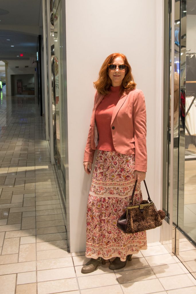
I discovered this Stella Forest skirt at one of their boutiques near our hotel in Paris during a birthday/House of Dior Exhibit getaway this year.
To see my favorite place in Paris: See this post
I couldn’t pass up the color palette and intricate floral pattern of this skirt. It’s a bit unusual as is the silhouette. Feminine and modern with its two tier approach of soft gathers and use of border print.
While this skirt screams Boho, I chose to style it with more structure, playing against type to show how versatile a floral skirt can be.
To see it styled Boho: See Boho fab floral skirt post here.
Another Fashion Don’t: Don’t cut up a vertical line in a skirt/pant with a horizontal line because it chops up your silhouette and eliminates the longer-and-leaner look. Again, so many fashion rules to break, so little time.
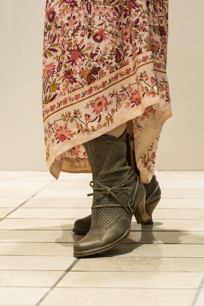
Feeling the French inspiration from memories triggered by the skirt, I paired it with these dark sage boots. I picked these up in a little shop on the Left Bank some years ago when my husband, Michael, and I were celebrating our 20th wedding anniversary on our 22nd anniversary. Mieux vaux tard que jamais, as the French say. Better late than never! I like the modern Victorian vibe and the heel is thick enough to be comfortable and easy to walk in without worrying about falling over.
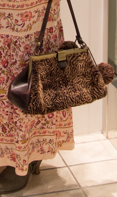
As the finishing touch, a furry favorite handbag from Patricia Nash.
Do you find that color affects your mood? Are you happier when wearing bright colors, relaxed when wearing cool, subdued when wearing black? On the flip side, do you let your mood determine what colors you wear? Let me know your thoughts by leaving a comment below. Thanks! I use the feedback from this site to help design clothes we will love.
With mirth and laughter , let old wrinkles come .
– Shakespeare.
Love,
Dee
Shirt: Land’s End (other Land’s End mock turtlenecks here, a similar style here)**
Jacket: H&M (H&M blazer – used + size 4, H&M blazer – used + size 6, H&M blazer – used + size 10, H&M blazer in black – used + size 6, H&M blazer in black – used + size 2, H&M blazer in fuchsia – used + size 2, H&M blazer in fuchsia – used + size 12, coral blazer size S-2XL)**
Skirt: Stella Forrest (Stella Forest, a similar skirt in a blue muted palette)**
Boots: (a similar green boot, a Victorian boot)**
Bag: Patricia Nash (Patricia Nash, a similar Patricia Nash bag)**
**I cannot vouch for the quality of these items, I only know that they resemble the ones I own and love.
Leave a Reply